Active Life Centre
A conceptual redesign for a community wellness centre, built around user groups with different levels of digital familiarity. Journey analysis and a five-part sitemap drove clearer program discovery, schedules and registration.
Individual academic project
Interview notes, Personas, User journey map, Sitemap, Low-fidelity wireframes, High-fidelity designs, Interactive prototype
01 The brief
A community wellness centre's website made its own programs hard to find. Content was disorganised, mobile performance was slow, registration was complicated, and the type and contrast were difficult for older users.
The audience is unusually wide for one site: fitness enthusiasts and seniors as primary users, with coordinators, instructors, parents registering children and hosts booking spaces alongside them.
The objective was a platform where someone can find a class, check when it runs and register, on a phone, without help.
02 Research
Research covered several distinct user groups and produced interview notes, three personas and a user journey map.
The journey analysis traced five stages, from access and discovery through filtering, registration and communication to post-event feedback. Three problems recurred: slow loading, filters too generic to narrow anything down, and no way to register more than one person at a time. Finding a schedule and registering on a phone was the sharpest pain point, and it is the problem the rest of the project answers.
Limitation: the project documentation does not record how the interview notes were gathered or how many people took part, so the personas are best read as structured assumptions about the centre's audiences rather than as validated research profiles.
03 Strategy
Four priorities, in order:
- Discoverability — categories and filters that match how people look for a class
- Accessibility — readable type and sufficient contrast, since seniors are a primary audience
- Efficiency — filtering by age, activity, instructor and time
- Engagement — testimonials and instructor profiles, to give returning visitors something new
04 What I made
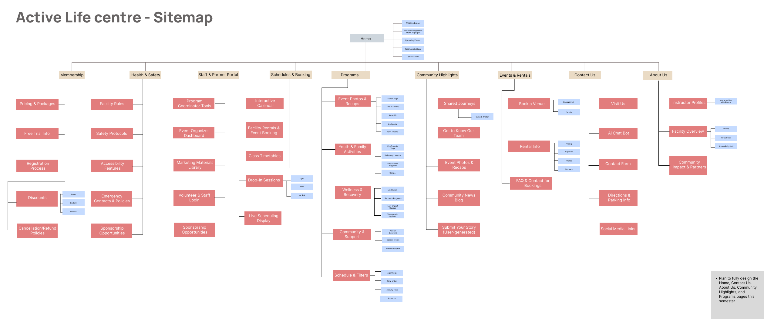
Sitemap. Five areas: Programs; Schedules and Booking; Community Highlights; Events and Rentals; About and Contact. Discovery and booking are separated, because browsing and committing are different tasks.
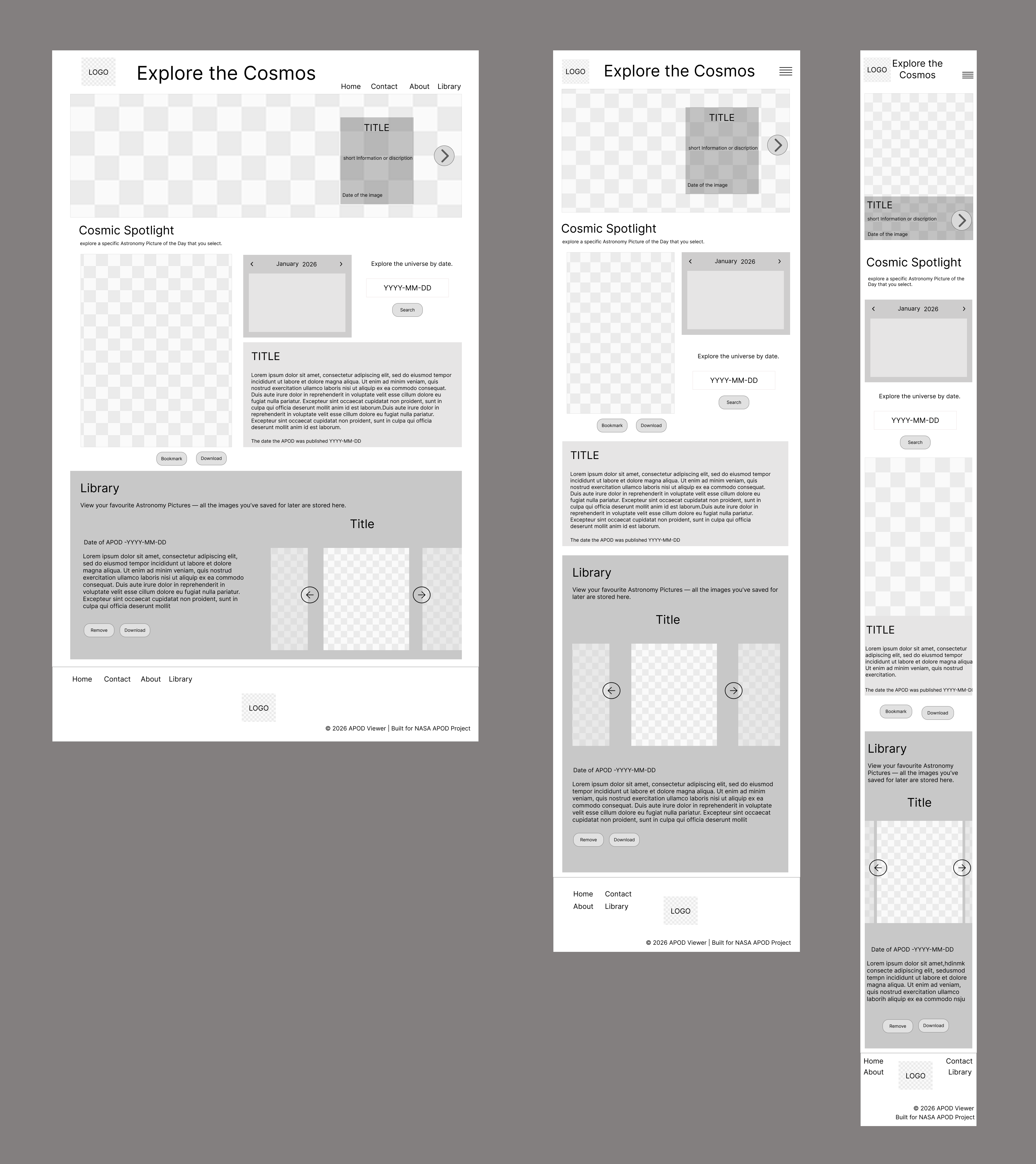
Wireframes. Low fidelity first, across desktop, tablet and mobile, to settle structure before any visual decisions.
Programs Highlights. The worked example, designed across desktop, tablet and mobile. The desktop layout is shown here; the mobile layout carries the registration path that previously failed.
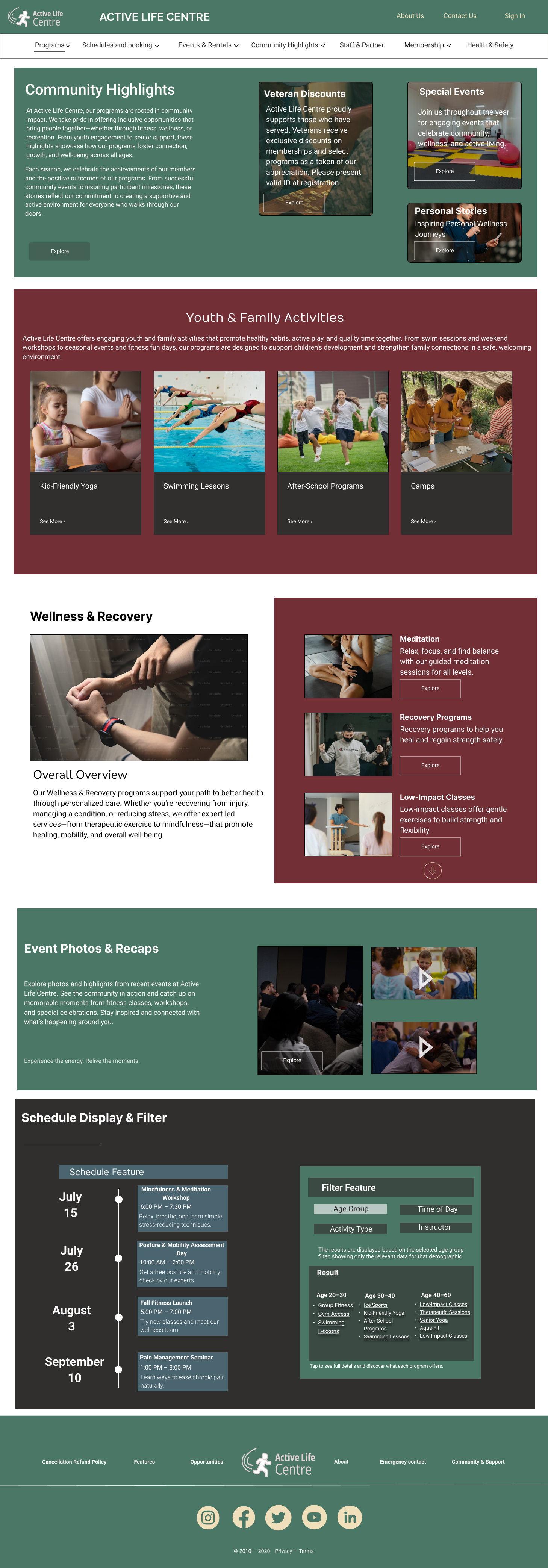
Visual system. Earthy greens, warm maroons and soft neutrals, with Raleway, Nunito and Roboto; components include program cards, schedules, testimonial sliders and filter panels.
06 Results
Delivered a full redesign concept: research artifacts, a five-part sitemap, wireframes across three breakpoints, high-fidelity designs and an interactive prototype.
The structure answers the journey analysis directly — filters narrow by age, activity, instructor and time rather than by category alone, schedules and booking sit together, and the mobile layout carries the registration path that previously failed.
This was a conceptual redesign, not a live site, so no performance or registration figures exist.
07 Reflection
No usability testing was run on the prototype. The filtering and registration decisions follow from the journey analysis rather than from observed behaviour, which is the honest limit of this project.
The test I would most want to run is the one the whole structure depends on: watching someone over sixty find a class and register for it on a phone, without help, and timing where they stop.