Responsive Web Experience for Exploring Astronomy Images
This project was developed as part of a web development and UX design course focused on responsive design and interactive web applications. The goal was to design and develop a dynamic interface that allows users to browse daily astronomy images, search historical content, and manage a personal library of saved images.
The design process combined UX design methodologies with front-end development techniques, integrating responsive layout principles, interaction design, and dynamic data retrieval.
NASA’s APOD archive contains a vast collection of astronomy imagery accompanied by detailed scientific descriptions. However, exploring this content efficiently can be challenging when users want to quickly browse images, search by specific dates, or revisit previously viewed content.
The challenge of this project was to design a responsive interface that simplifies the discovery process while maintaining clarity, usability, and strong visual emphasis on the astronomical imagery.
The project focused on several key objectives:
• Enable users to easily explore daily astronomy images
• Provide an intuitive search mechanism for historical APOD entries
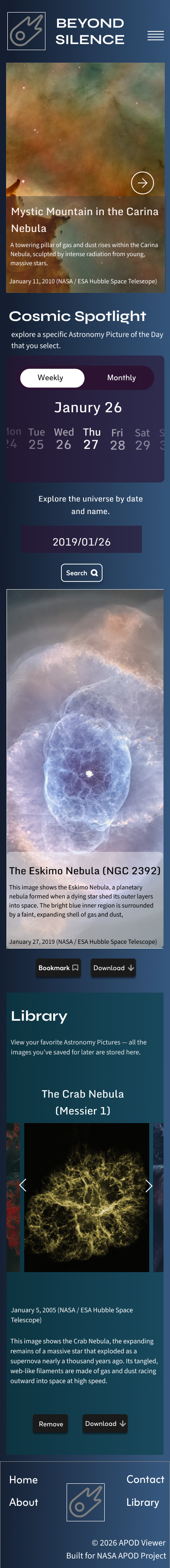
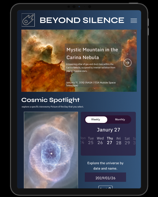
• Create a responsive interface optimized for desktop, tablet, and mobile
• Support user interaction through bookmarking and image downloads
• Maintain visual emphasis on high-resolution imagery while preserving readability
The design process began with examining how users interact with visual archives and content-driven websites. Particular attention was given to navigation patterns commonly used for media exploration, as well as responsive layout techniques for displaying large visual assets.
Research focused on understanding how users approach browsing, searching, and saving content. This informed the development of an interface that balances exploration and structured navigation.
The insights gathered during this phase helped define the information hierarchy, content grouping, and interaction model used in the final interface.
During the ideation phase, the application structure was defined through layout exploration and information architecture planning.
The interface was organized into several primary content sections:
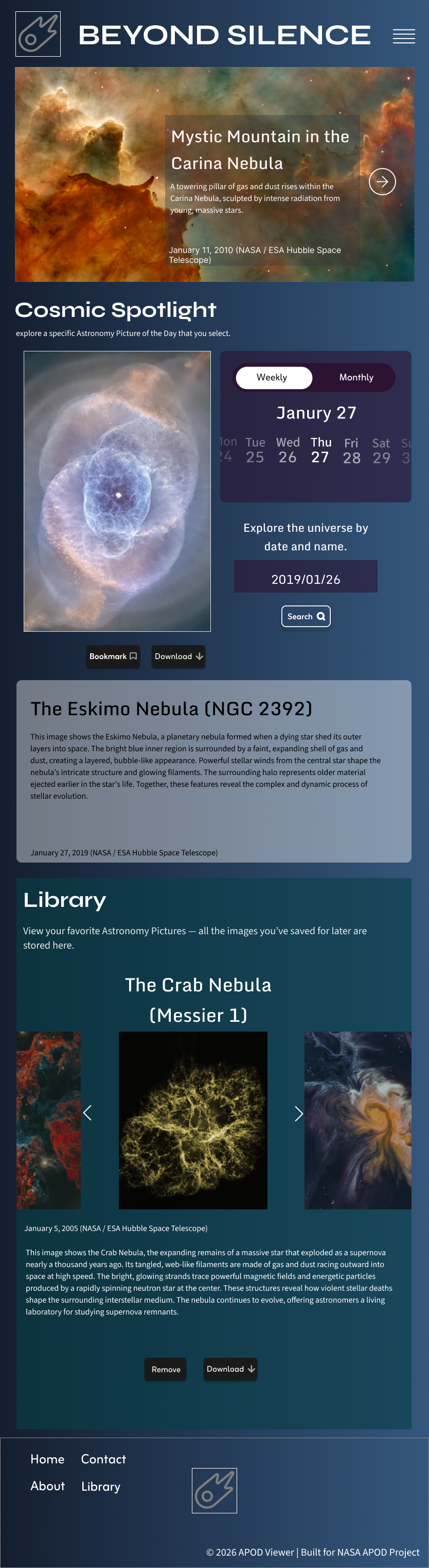
Featured Astronomy Image
A hero section that highlights the daily featured astronomy image and introduces the content experience.
Cosmic Spotlight
A focused viewing area where users can explore the selected APOD entry along with detailed contextual information.
Calendar-Based Search Interface
A date selection tool that enables users to browse historical astronomy images through an intuitive calendar interaction.
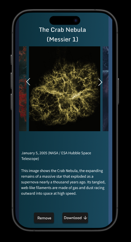
Personal Library
A collection area where users can store bookmarked images for future reference.
This structure allows users to move seamlessly between discovery, exploration, and personal content management.
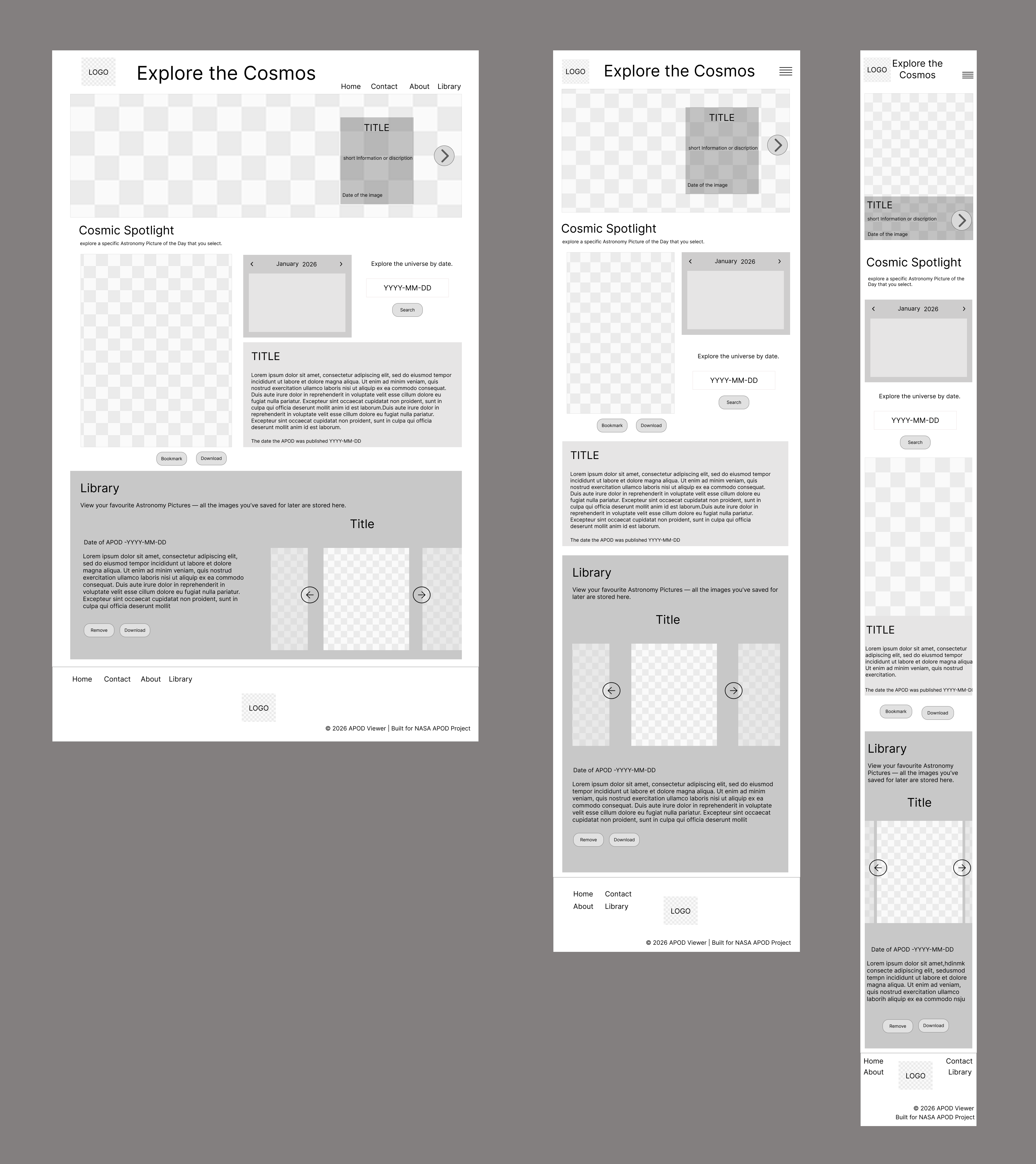
Low-fidelity wireframes were developed to establish the structure, layout, and information hierarchy of the Active Life Centre platform. At this stage, the focus was on organizing content, defining navigation flows, and ensuring key features such as program listings, schedules, and community highlights were easy for users to locate across desktop, tablet, and mobile interfaces.
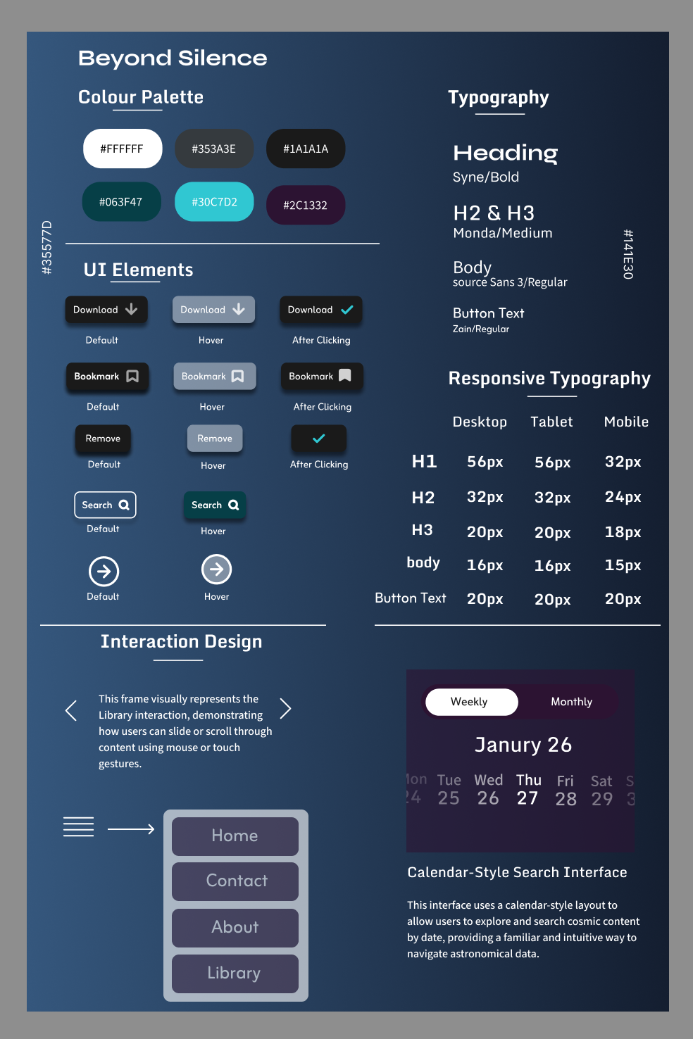
A cohesive visual system was developed to support consistency across the interface.
The design draws inspiration from the visual characteristics of deep space imagery. Dark gradients and cool tones were used to create a calm, immersive environment while ensuring that astronomical visuals remain the primary focus of the interface.
Typography was selected to maintain readability across devices while establishing a clear hierarchy between titles, descriptions, and metadata.
Reusable UI components such as bookmark buttons, download controls, navigation icons, and search interfaces were designed to provide clear interaction feedback and maintain consistency throughout the application.
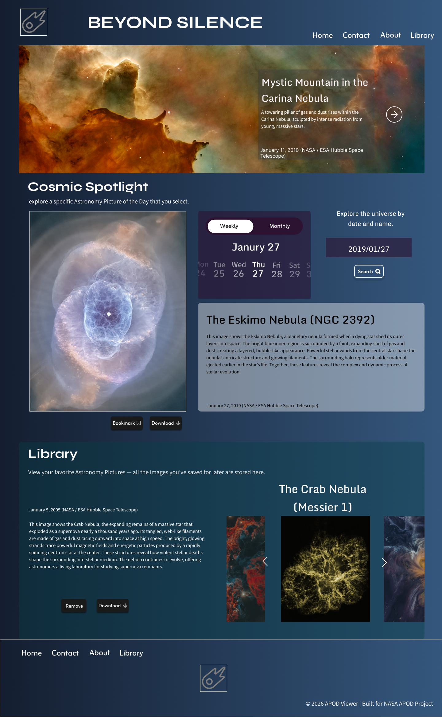
The high-fidelity stage translated the structural wireframes into a polished interface that reflects the final user experience.
Special attention was given to visual hierarchy, spacing, and content presentation to ensure that imagery remains the central element of the design. The interface balances large visual assets with contextual information while maintaining readability and usability.
Responsive layouts were refined to ensure that the interface adapts smoothly across desktop, tablet, and mobile devices, maintaining consistent interaction patterns and visual clarity.
An interactive prototype was created to simulate the full user experience and evaluate the interaction flow of the application.
The prototype demonstrates key interactions including browsing featured images, selecting dates through the calendar interface, saving images to a personal library, and navigating through stored content.
This stage helped validate the usability of the interface and allowed interaction patterns to be refined before development.
This is your chance to make a significant change in your life.


.png)